Though I do not make an exclusive claim (as I know there are exceptions), one of the outcomes of modernist painting was its liberation of color. While Van Gogh’s colors are largely the right categories (sunflowers are still yellow and the sky still blue), their depth and hue exceed those of experience (no sun flower is that yellow, and no sky so deeply blue that it has not fallen to black).
Other artists went further, giving things colors no one would expect. In 1907 Matisse painted a blue nude. As lived experience runs blue skin suggests asphyxiation, but on Matisse canvas blue breathes with the figure’s body in a compelling sensuality. It was only a few years later that Robert Delauney painted "Premier Disque," a polychromatic wheel of color. There, color is just about all the artist works with, as many subsequent artists further explored, perhaps culminating in Abstract Expression.
So color can be on its own. This does not mean there is such a thing as a pure color, for color always comes on some material that is shaped as some form that carries its own connotations. This does mean though that we need not definitively anchor a color with the use or function of its object.
The arrangement of the colors of food on a plate do not matter to the hungry, but a satiated dinner partner may notice the unintentional gradation of green vegetables that bring out the browns and cooked reds of meat. What is the need to notice, one may ask, as only sustenance is a necessity?
In case of true hunger that probably is the only thing one needs or cares about. But assuming minimal requirements are met in life I think there is the possibility to appreciate things aesthetically like the interaction of colors. And this should not be confined to the museum. The intentional colors we see in a gallery are only a prompt to go out and find others in day-to-day experience. Maybe they will not be as vivid, formally appealing or absolute but they are there.
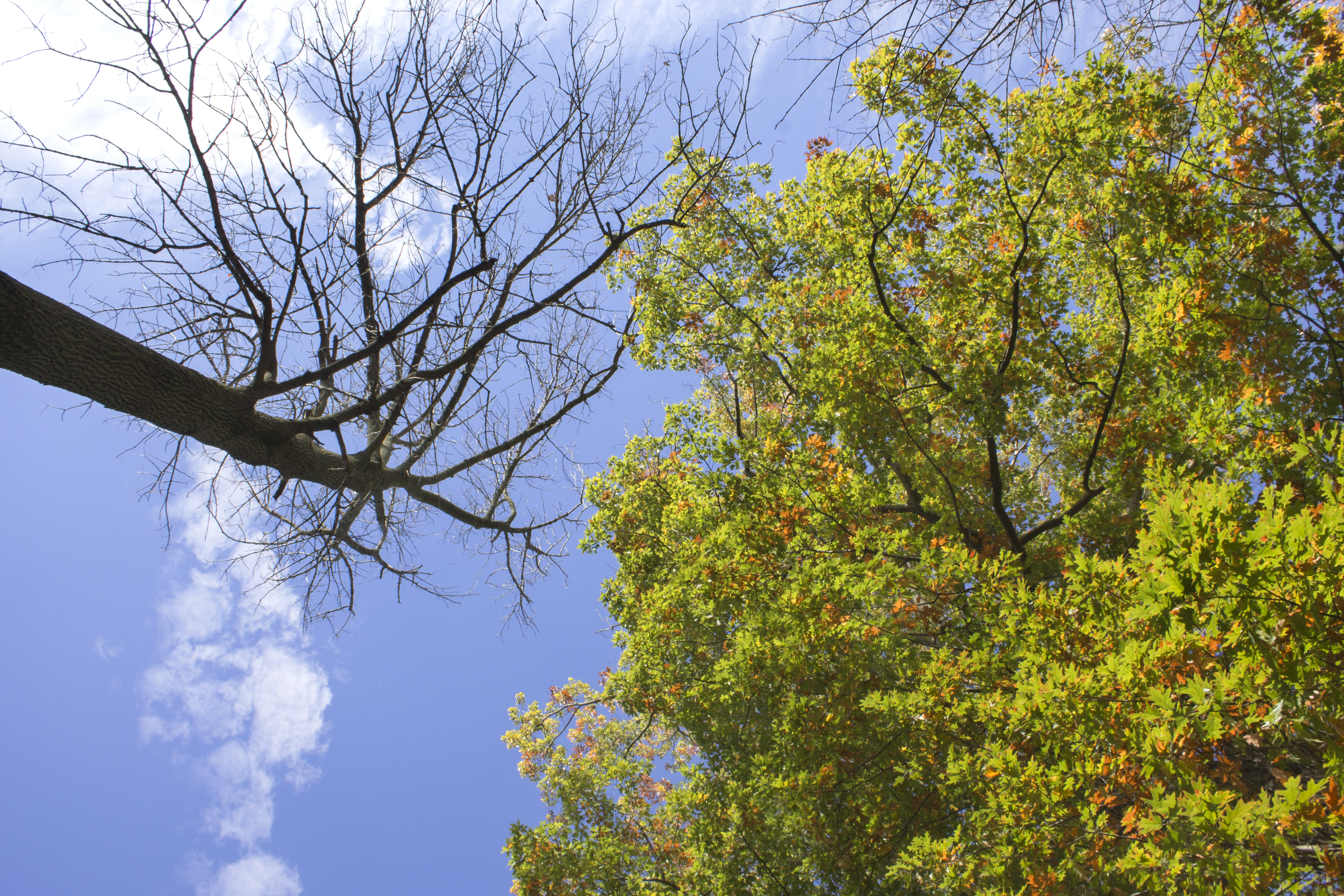
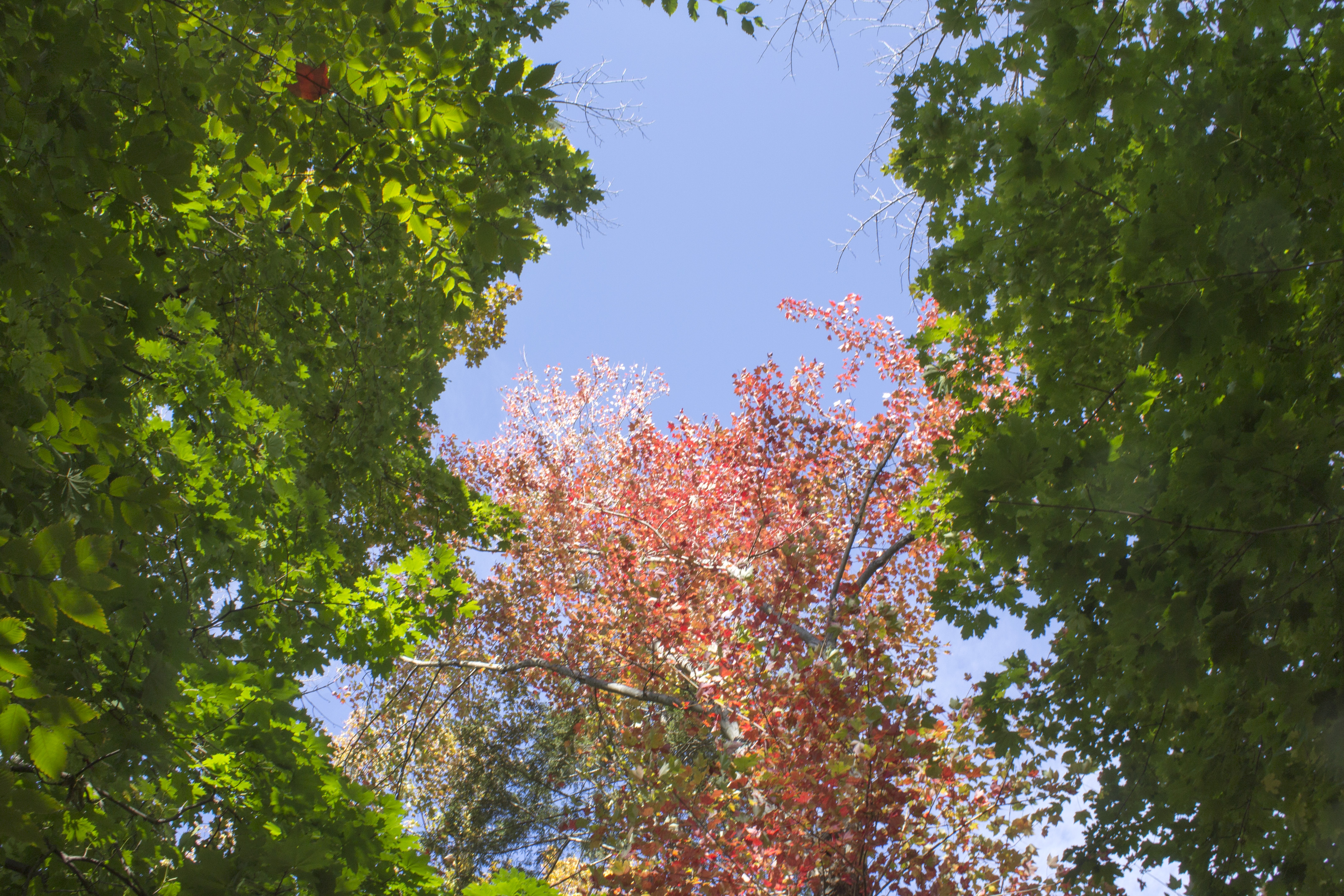
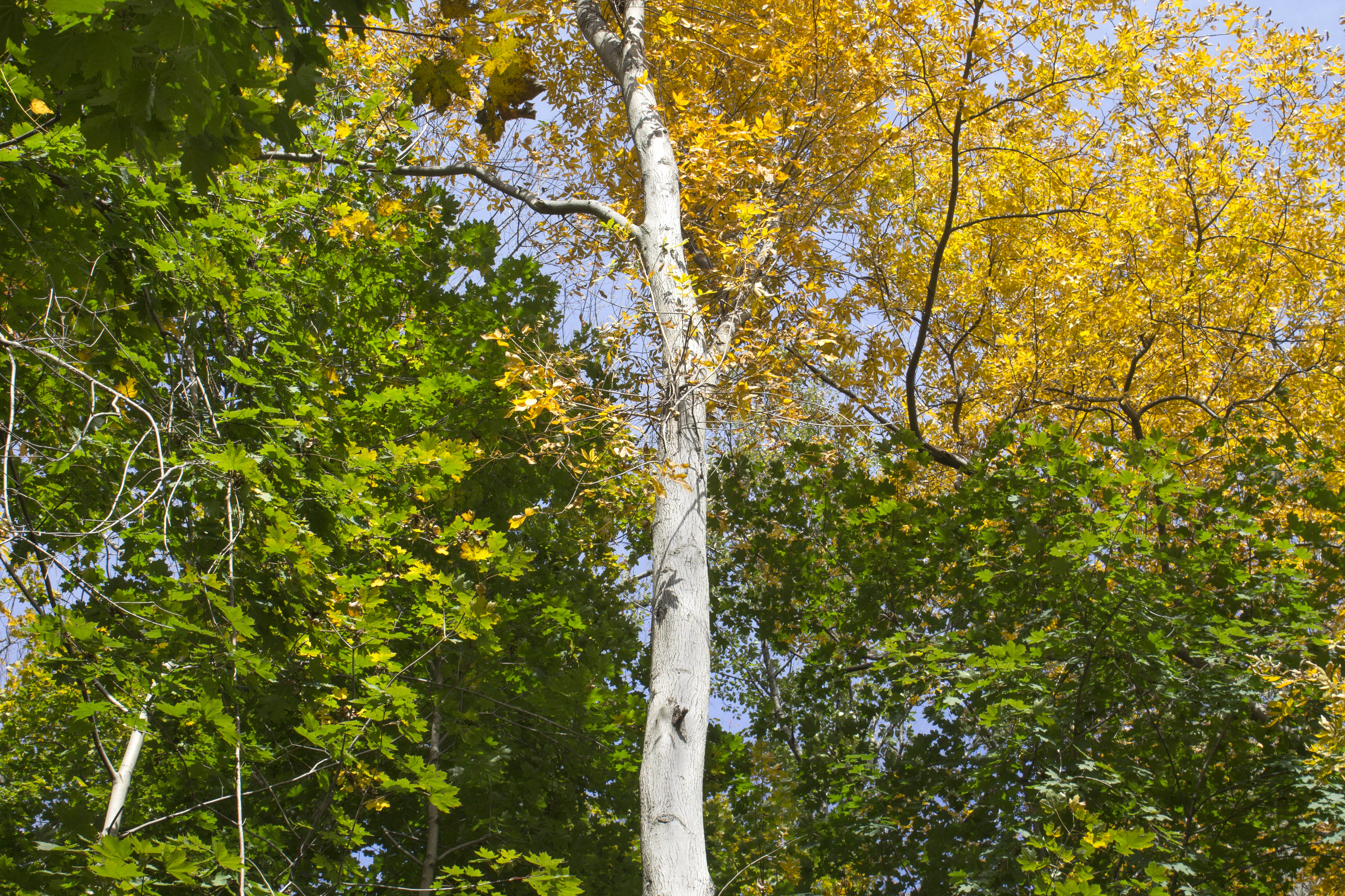
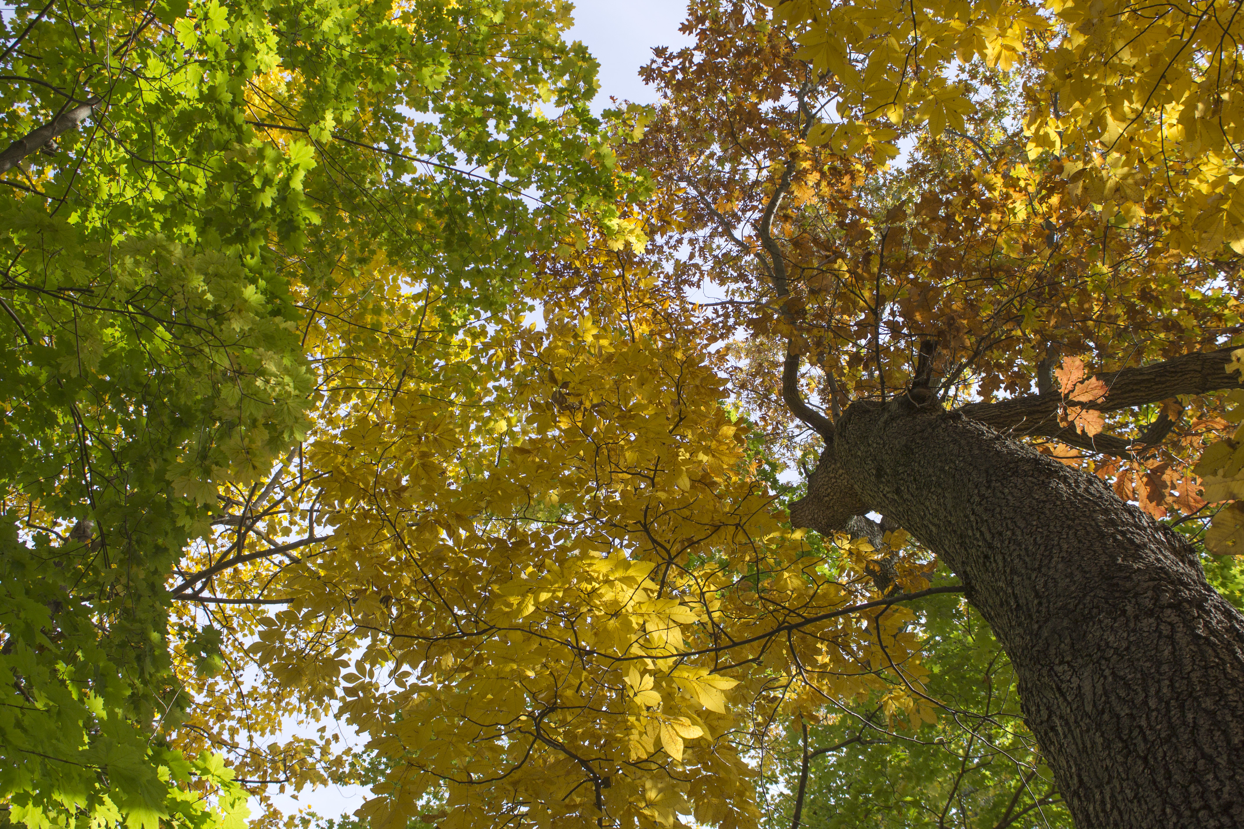
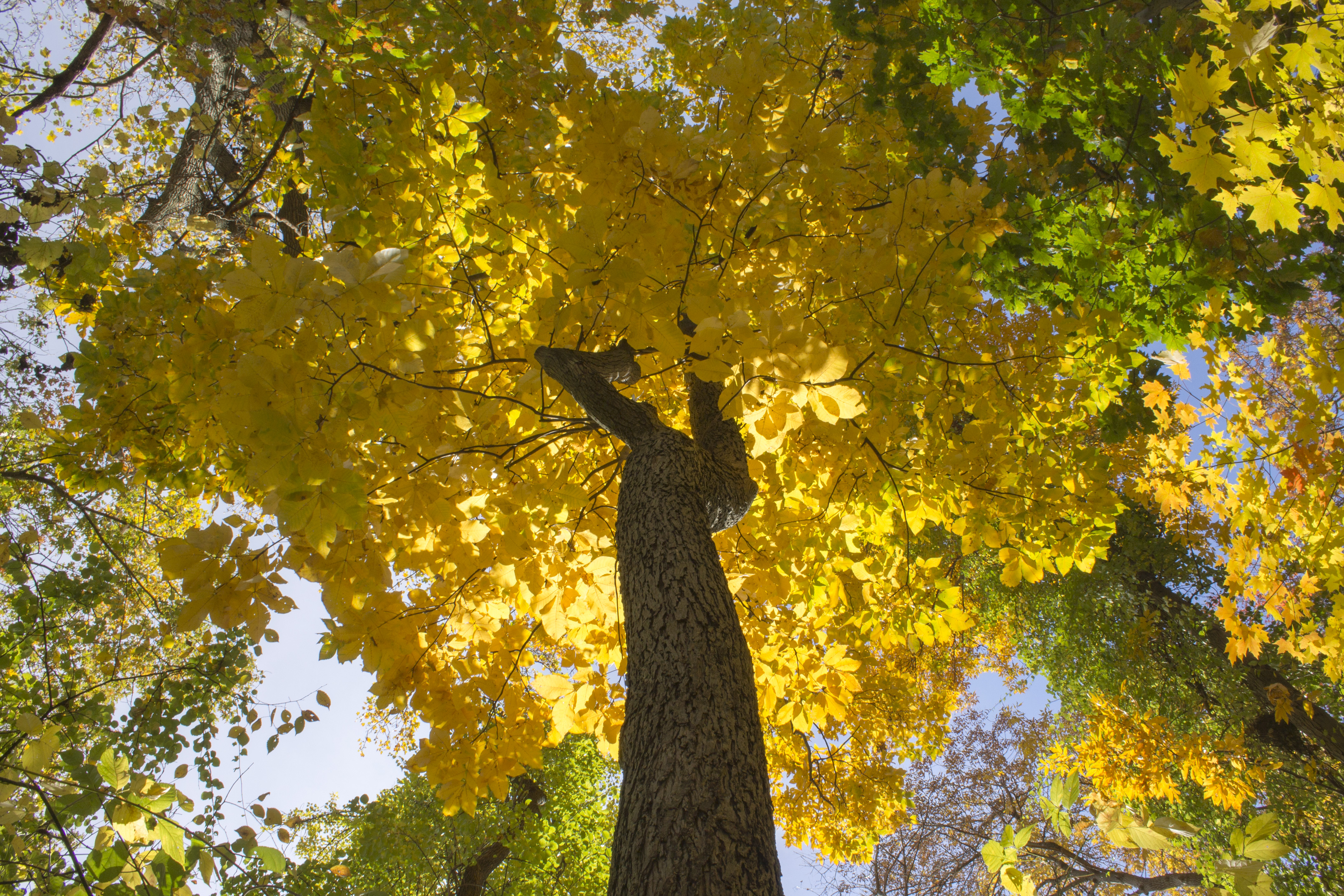
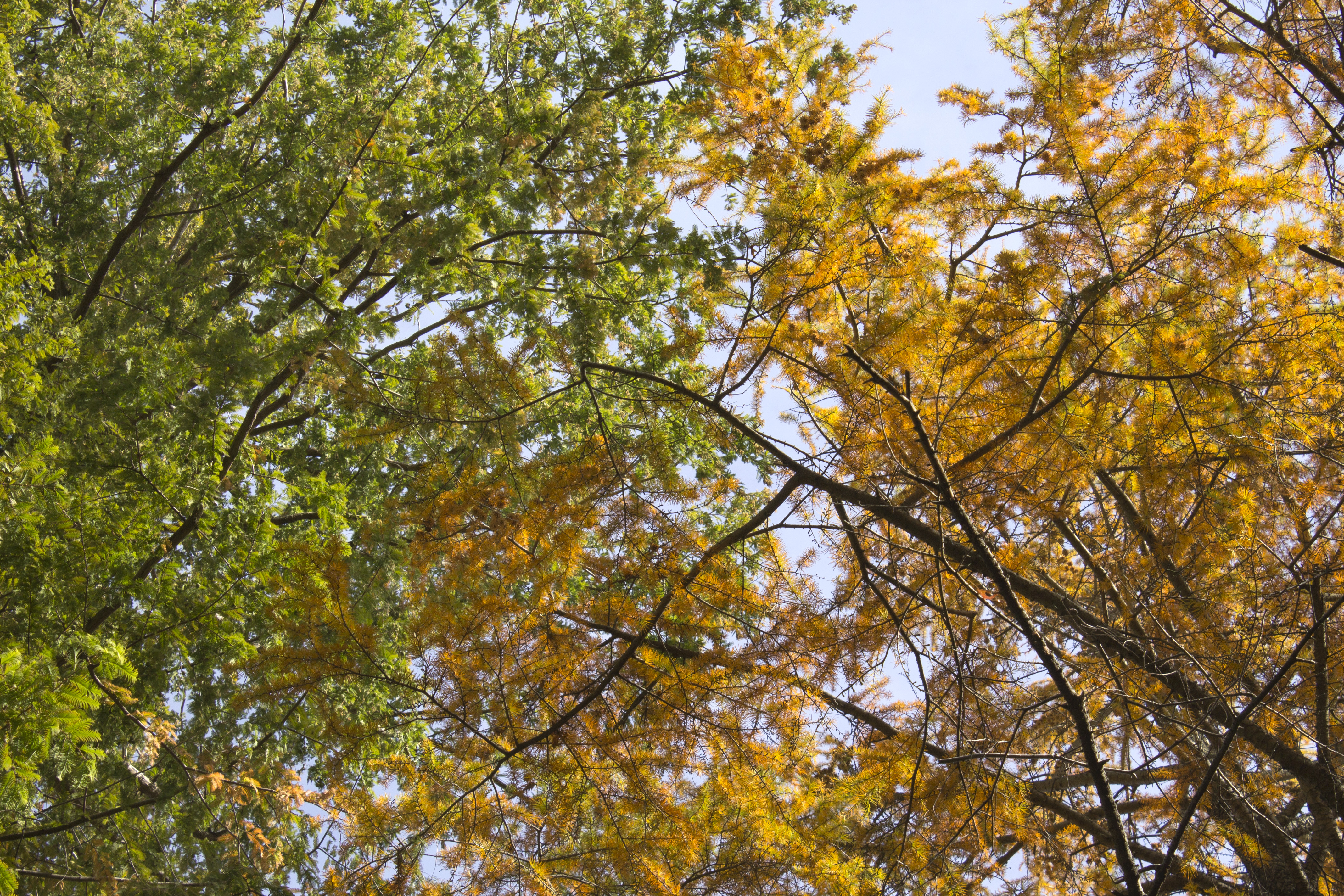
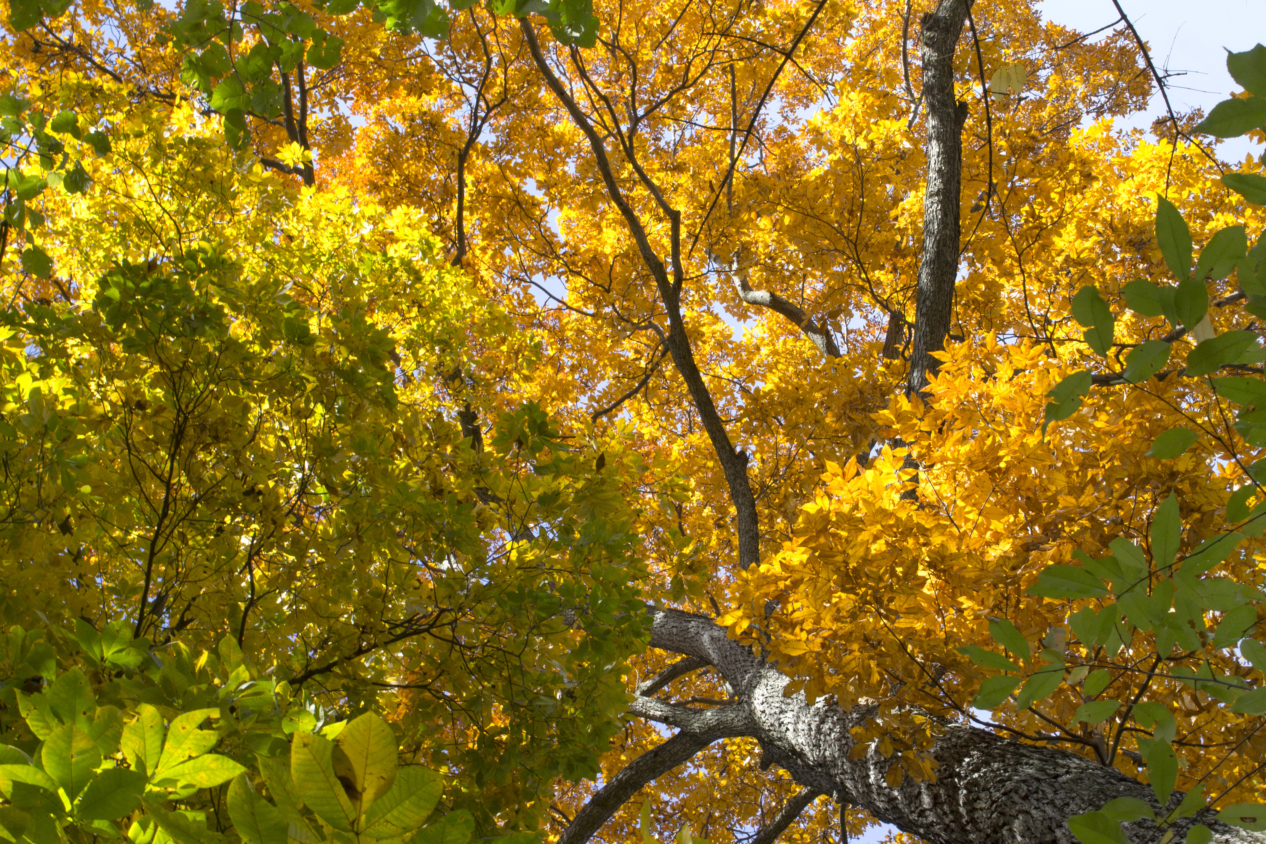
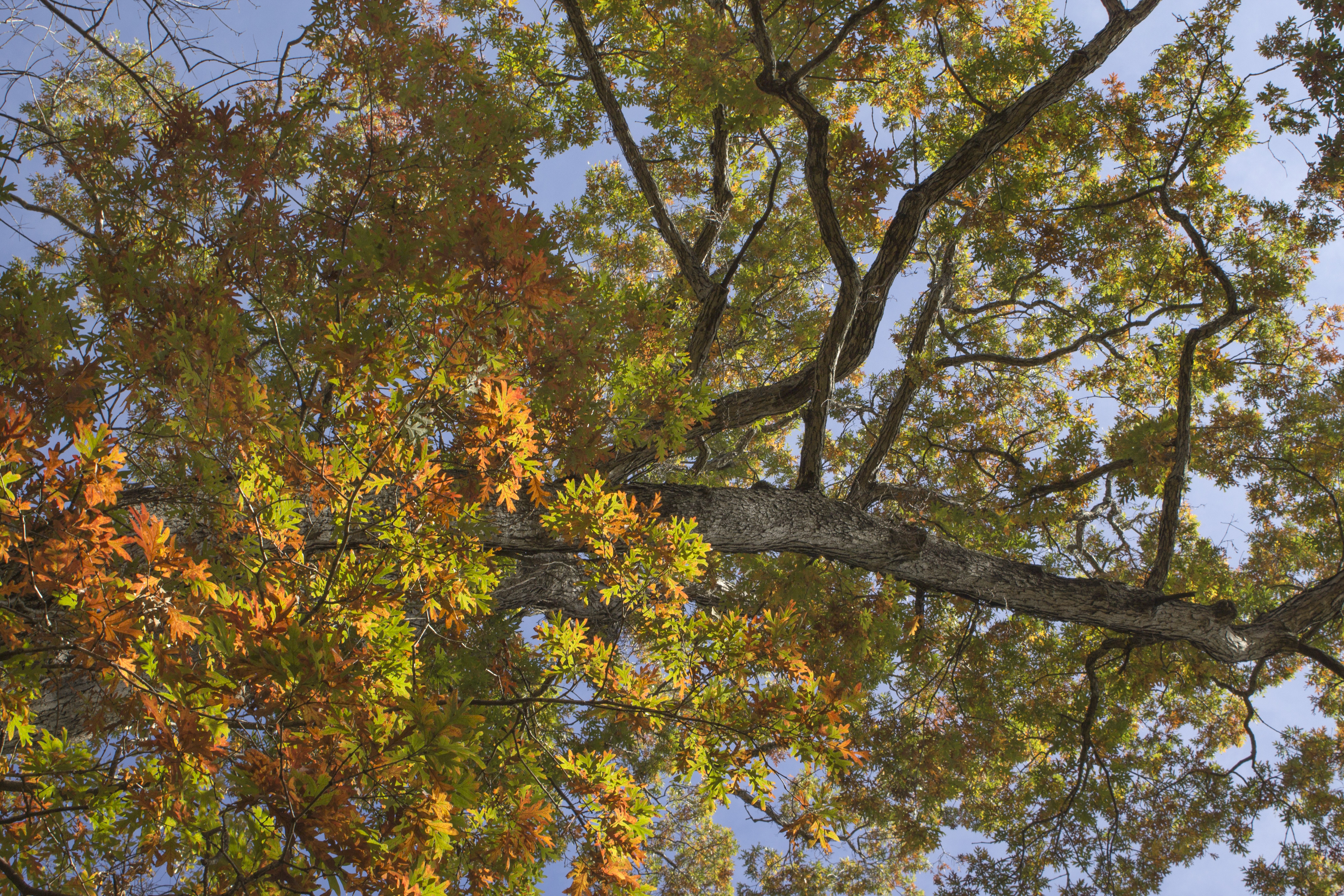
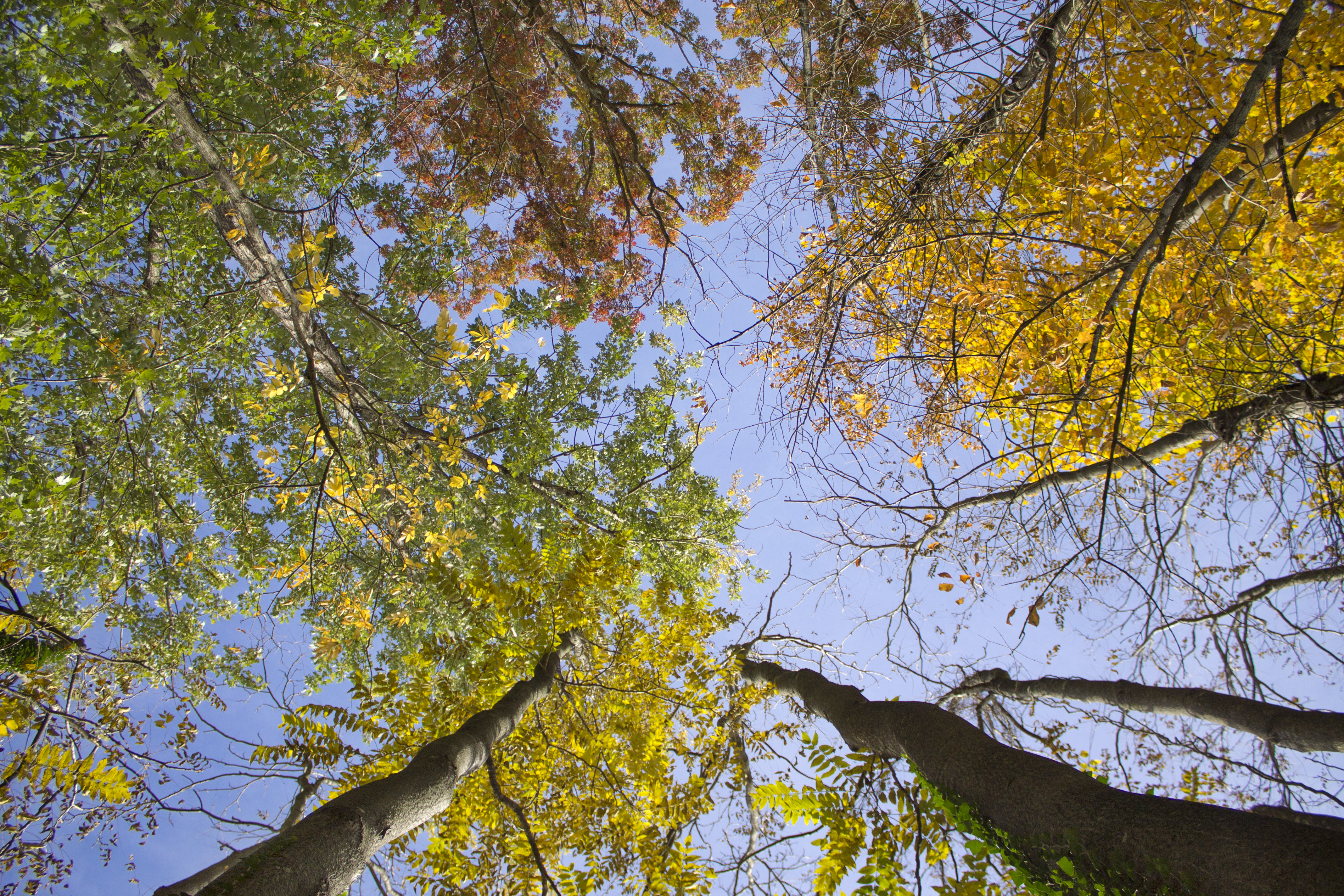
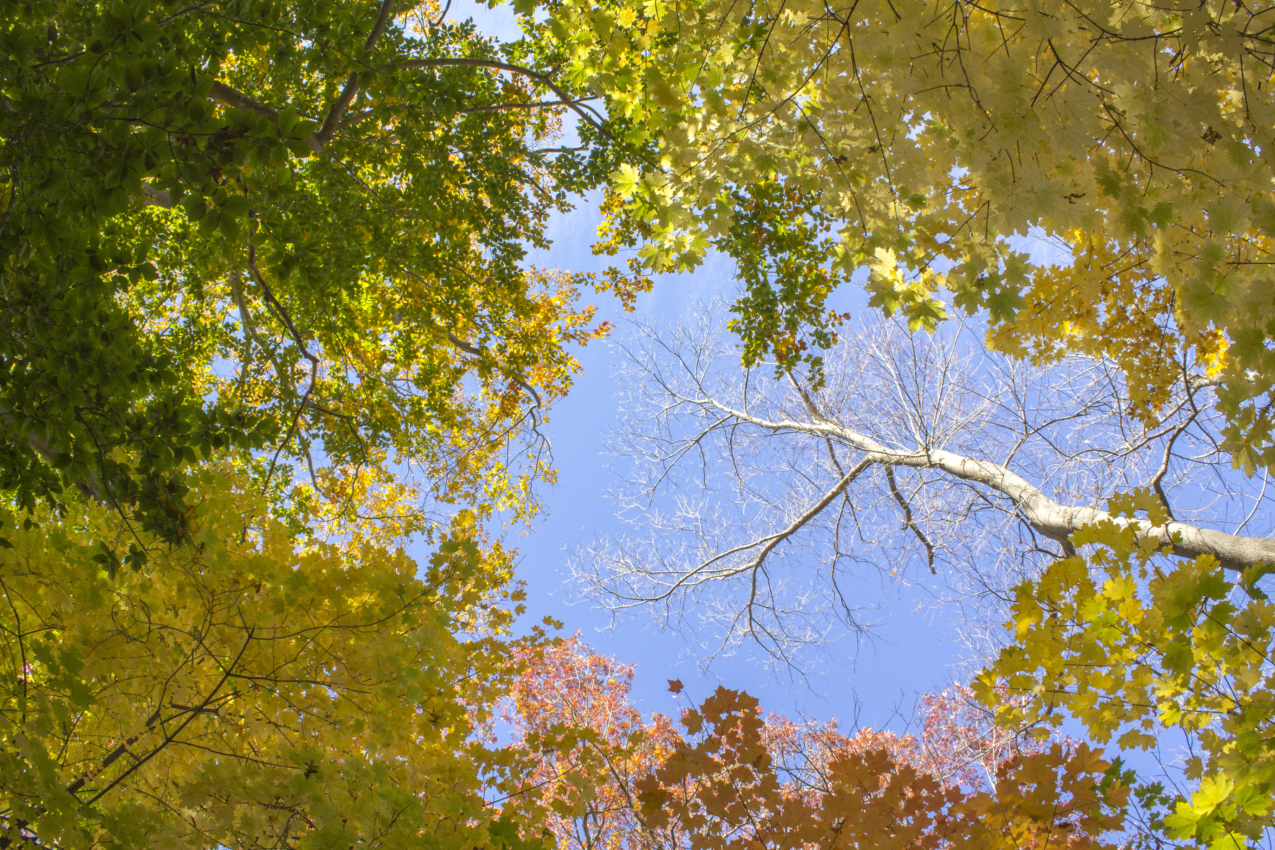
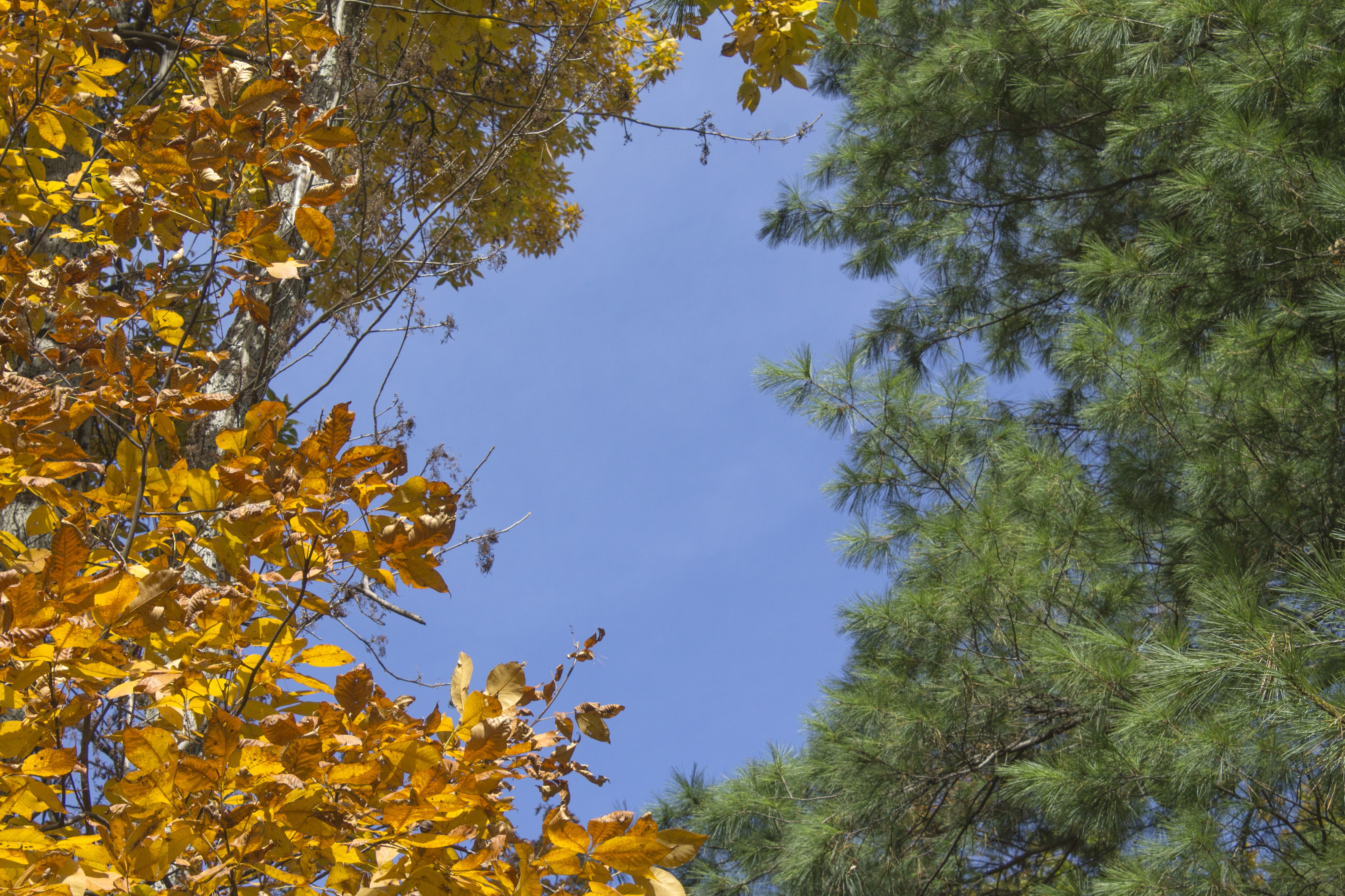
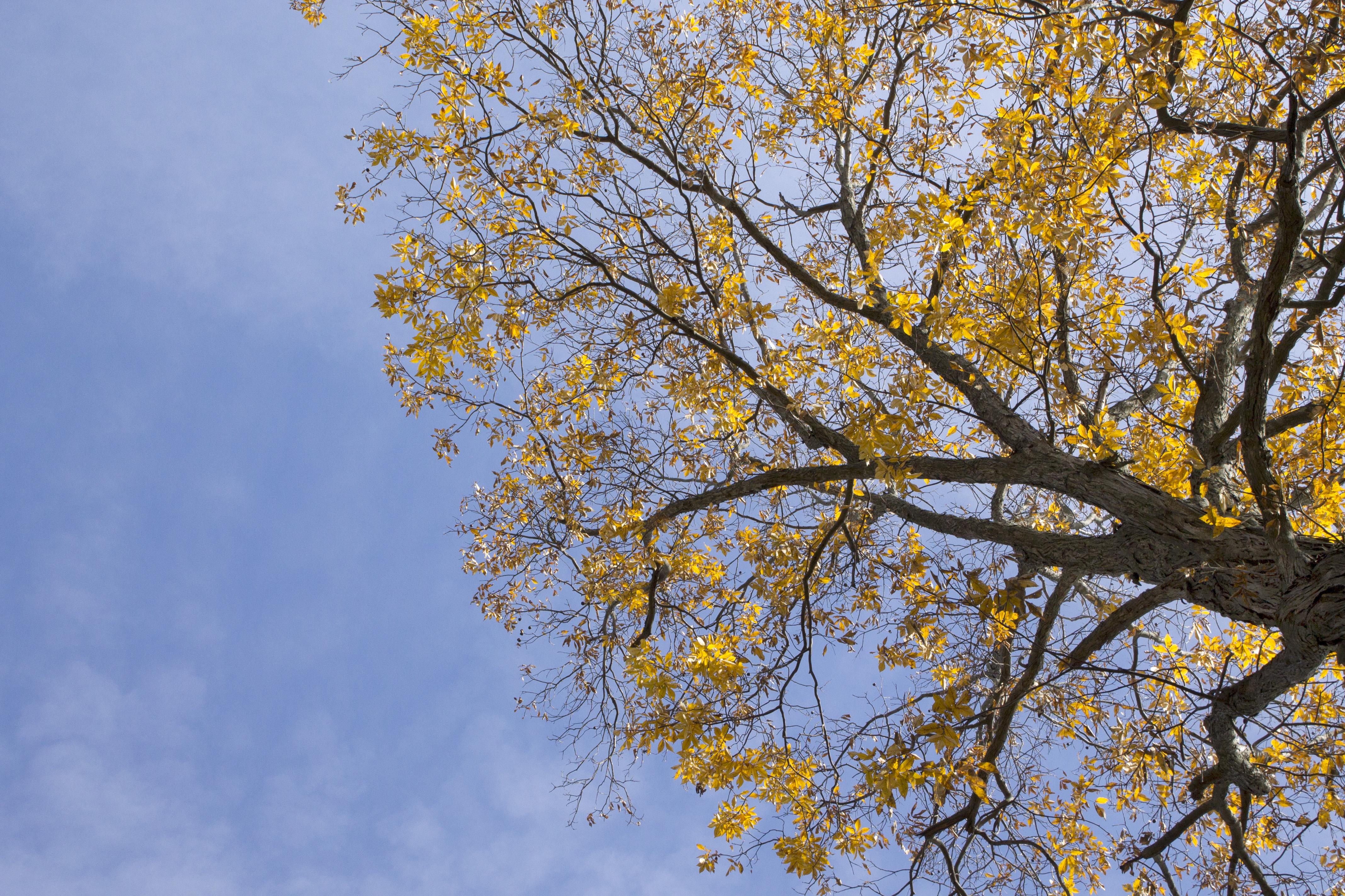
This prompt of course is easy to follow in autumn. Look down or straight ahead and of course there are browns, greens, oranges and reds among patches of fleeting green leaves. But look up and something changes. We spend most of our time looking out for the dangers at our feet or the opportunities at eye level. Not much we need comes from looking up, but there is much we often appreciate like the rise of a skyscraper or passing of a jet.
Looking up seems to be conducive to an aesthetic mood. Do so under October and November’s foliage for a moment and one might readily imagine October’s and November’s polychromatic abstractions. Serpentine black lines set against blue sprout a variety of shapes that vibrate, gleam, withdraw and parade in boastful yellow, demur orange, loud red and occasional obstinate green. But before long of course, a Suprematist composition will take over in white on white for the winter months.[1]
[1] Suprematism being a Russian avant-garde art movement, and not the racial term.


