The summer before my junior year of high school, I bought myself a tablet, a student-discounted version of Photoshop, and the world of fun that combination unlocks.

I'll talk more about digital art in a later post, but today let me introduce you to SDA, the Student Design Agency. In wording stolen from their website, SDA is dedicated to providing the University community with quality print, web and graphic design services at affordable rates. Woohoo, great posters and designs! Toward the end of freshman year, I discovered SDA through their spring workshops in graphic design and its tools. Their presentations ended up greatly shaping my pursuits at Princeton thus far.

I was taken completely by the introduction to graphic design. Though I'd always loved art, I'd never seen visual forms from the perspective of design. The logo of the local news TV channel, the poster for that lecturer, the visual decisions that saturate our world; these were consciously planned and executed? And Princeton has an agency of student designers that I could be a part of? Whaaaaat!
About two semesters later, I'm still so excited to be in on the super cool operation that is SDA. I still lean toward illustration, and there's a place for that in design and the agency! Let me give you a peek into the inner workings of a project, accompanied by the more specific example of the Princeton Preview graphics.
1) The bid
I'll be drawing SDA peeps with hipster glasses because my mind used to assume "graphic designer" was synonymous with "hipster." I know some more designers now and found that's not true, but I'm going to roll with it here.

Through the SDA site, a client first submits a project request. The student manager(s) of SDA send out the brief to the agency, interested designers bid on the project with ideas or sketches, and the managers pick one designer for the client's project.
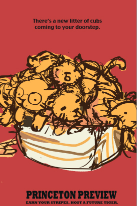
The process was slightly different for Princeton Preview, but I'll adopt it for this example. "Earn your stripes. Host a future tiger," is Preview's signature tagline, but besides that, the Princeton Preview project left most creative decisions free. One day in class, I was brainstorming for the bid (while also listening to the professor and taking notes, of course). My doodles went from patterns of stripes to big tigers, baby tigers, lots of baby tigers, lots of baby tigers in a box, and eventually a bunch of beloved pre-frosh arriving at Princeton like a sweet delivery of baby tigers.
So my bid was this mock-up:
2) First Proof
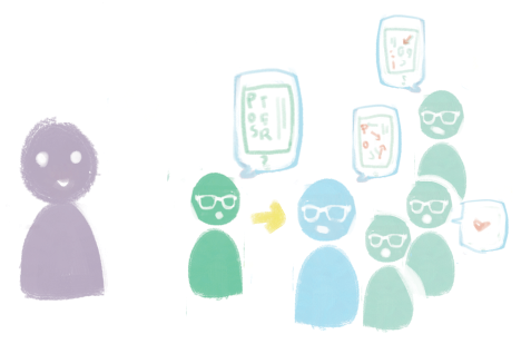
The designer works more on the design, then posts it on the SDA forums for the agency to review and critique.
The draft went through lots of cleaning up on my part and patient massaging and critique on the SDA forums. There was collaborative input on things like choosing the alignment of the text, refining the illustration, and deciding on the actual theme. At one point, there was actually a doorstep drawn (that was too busy looking), and at another point, I had this whole "adoption" theme (that was too sad).
In the end, we actually sent to the client two proofs versions:
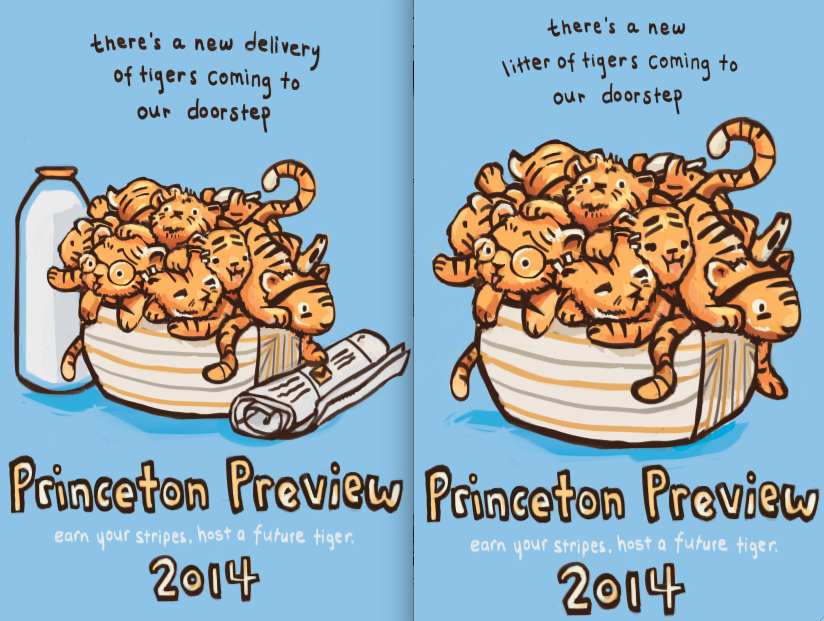
The first was an extended "delivery" idea, and the second focused more on the actual litter of tigers.
3) Revisions and Refining
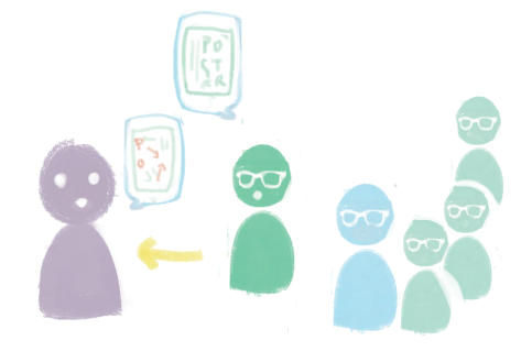
Once the piece is revised and approved by the managers, the designer runs the proof by the client. Usually the client requests a few changes, so the designer will go back, work more with the input of the agency, get approved, then run it by the client again. Usually there are a couple of projects running at once, so everyone doesn't just wait in breathless anticipation, as shown here.
The client chose the second option of the proofs, and from there it was a matter of back and forth, cleaning up and refining. This client was really enthusiastic about the whole thing, which just made the project all the better. The most noticeable changes requested from the first proof included replacing most of the handwriting with a font and going for a cleaner illustration style.
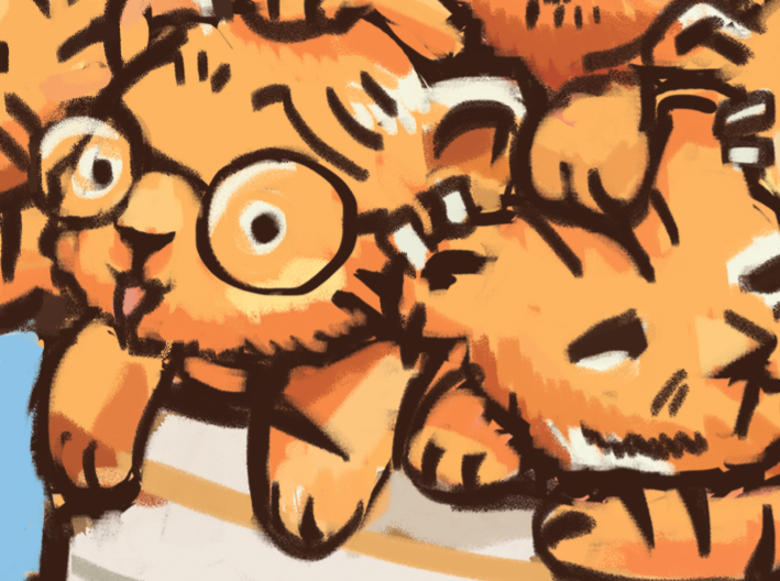
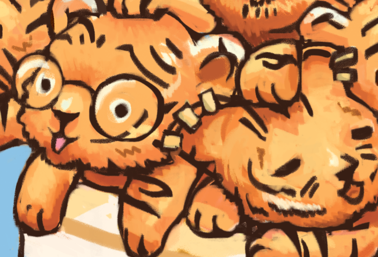
I like to listen to audiobooks while I draw, and I'm pretty sure I was on "The Three Musketeers" for this project. I'm not sure what that has to do with anything, but I just wanted to share.
4) Wrapping up!

With some more revisions and back and forth between client/designer/agency forums, you get to a final product everyone is happy with. Hooray!
The entire process has so much to teach, whether you're the project designer, critiquing peer, or creeper digging through old project threads. I'm still constantly awed by the abilities and styles that exist among my peer designers, and I think it's awesome to see these people help each other create beautiful, beautiful work. Yup, SDA is pretty incredible.
The final version of the poster:

After that was finalized, I flattened the colors out a bit and used the headless Customink guy to model the Preview shirt.
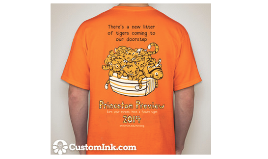
We ordered blue and orange versions of the shirt for Preview hosts and captains, and the project was wrapped up.
This project was definitely an absolute joy—was my job actually to draw baby tigers?!
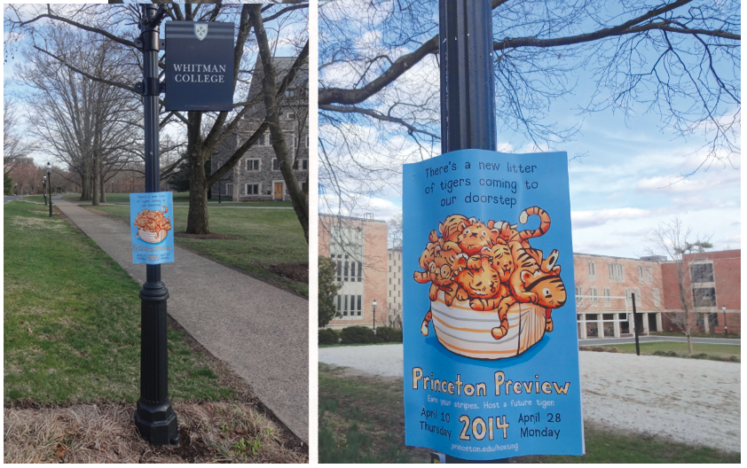
I get a little thrill every time I see a poster pop up, and if you see a girl quietly but happily dying when people start busting out their host shirts during Preview, that is probably Aliisa Lee.
Wait...
Was this post a shameless plug for SDA and a shameless plug for Princeton Preview?!?
...
YES.


